Introduction to Technical Analysis
Technical analysis is a methodology for evaluating financial instruments and forecasting future price movements based on the study of past market data, primarily price and volume. In the dynamic world of Forex, where trillions of dollars are exchanged daily, technical analysis serves as a crucial framework for traders and institutions to identify trading opportunities and manage risk. Unlike fundamental analysis, which focuses on economic data, geopolitical events, and policy decisions, technical analysis operates on the premise that all relevant information is already discounted into the price.
The core principles underpinning technical analysis, first articulated by Charles Dow, remain relevant today:
- Market action discounts everything: This principle suggests that current prices reflect all available information, including fundamental data, market psychology, and expectations. Therefore, studying price action directly is sufficient.
- Prices move in trends: Financial markets, including Forex, tend to move in identifiable directions over a period. Identifying and trading with these trends is a central objective of technical analysts.
- History repeats itself: Human psychology, which drives market behavior, tends to be consistent over time. This leads to recurring price patterns that technical analysts believe can be used to predict future movements.
For Forex traders, technical analysis provides a structured approach to decision-making. It enables the identification of entry and exit points, the setting of stop-loss orders, and the determination of potential profit targets. By analyzing charts, patterns, and indicators, traders aim to gain an edge in predicting the probabilistic direction of currency pairs. While no analytical method can guarantee future results, a robust understanding of technical analysis tools is indispensable for navigating the complexities of the Forex market.
Key Takeaway: Technical analysis is a framework for predicting future price movements by studying historical price data, based on the principles that market action discounts everything, prices move in trends, and history tends to repeat itself.
Chart Types and Timeframes
The foundation of technical analysis lies in the visual representation of price data through charts. Different chart types offer varying levels of detail and insight into market dynamics. Understanding these types and how to apply them across various timeframes is fundamental for effective analysis.
Line Charts
The simplest form of price chart, a line chart, connects a series of closing prices over a specified period. Each point on the line represents the closing price for that period (e.g., the closing price of EUR/USD at the end of each day). While line charts provide a clear, uncluttered view of the overall trend, they lack detail regarding the price action within each period (i.e., the open, high, and low prices). They are often used for identifying broad trends and comparing multiple assets.
Bar Charts
Bar charts offer more information than line charts by displaying four key price points for each period: the open, high, low, and close (OHLC). A vertical line represents the range between the high and low price. A small horizontal line on the left side of the vertical bar indicates the opening price, while a similar line on the right indicates the closing price. The length of the bar shows the volatility for that period, and the relative positions of the open and close indicate bullish or bearish sentiment. Bar charts are a step up in detail, allowing for analysis of price ranges and individual period sentiment.
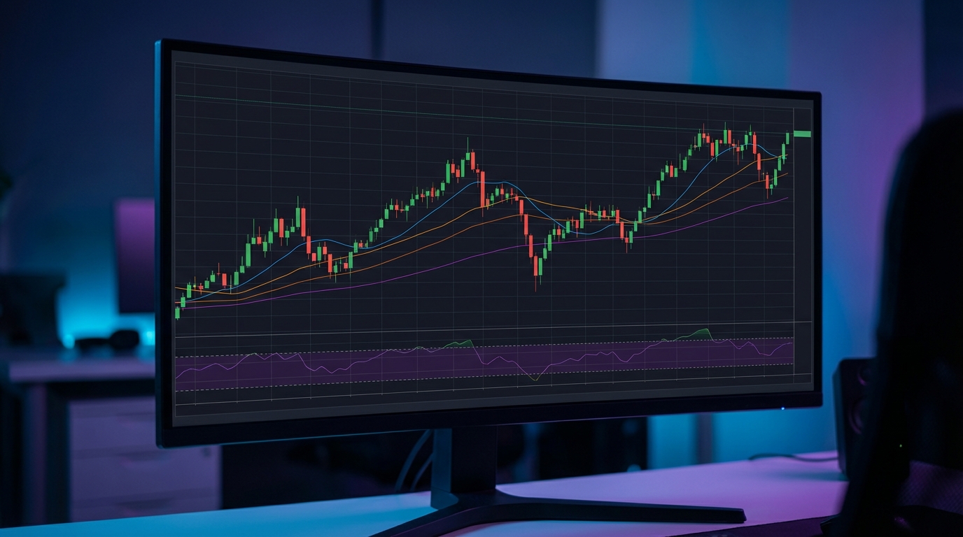
Candlestick Charts
Candlestick charts are arguably the most popular chart type among Forex traders due to their rich visual information and ease of interpretation. Originating from 18th-century Japanese rice traders, candlesticks also display the OHLC prices but do so in a highly intuitive graphical format. Each candlestick comprises a 'real body' and 'wicks' or 'shadows'.
- The real body represents the range between the opening and closing prices.
- If the close is higher than the open, the body is typically filled with a specific color (e.g., white or green), indicating a bullish candle.
- If the close is lower than the open, the body is usually filled with another color (e.g., black or red), indicating a bearish candle.
- The wicks (or shadows) extending above and below the real body represent the high and low prices reached during that period. The upper wick shows the high, and the lower wick shows the low.
The visual nature of candlesticks allows for quick identification of market sentiment, volatility, and potential reversal patterns, which will be explored in detail later.
Timeframes
A timeframe refers to the duration that each bar or candlestick represents. Traders can analyze charts across various timeframes, from tick charts (showing every single trade) to monthly charts. Common timeframes include:
- Short-term: 1-minute, 5-minute, 15-minute, 30-minute (often used by day traders and scalpers).
- Medium-term: 1-hour, 4-hour (popular for swing traders).
- Long-term: Daily, Weekly, Monthly (used by position traders and for broader market analysis).
The choice of timeframe depends heavily on a trader's trading style and objectives. Shorter timeframes offer more trading signals but are prone to more noise and false signals. Longer timeframes provide a clearer view of the underlying trend but offer fewer trading opportunities. Many professional traders utilize a multi-timeframe analysis approach, starting with a longer timeframe to identify the primary trend and then moving to a shorter timeframe to pinpoint entry and exit points. This hierarchical approach helps to confirm signals and reduce false positives.
Key Takeaway: Candlestick charts are preferred for their detailed visual representation of OHLC prices. Analyzing multiple timeframes (e.g., daily for trend, 4-hour for entry) provides a more robust understanding of market dynamics and helps confirm trading signals.
Candlestick Patterns
Candlestick patterns are specific formations of one or more candlesticks that are believed to indicate potential future price movements, particularly reversals or continuations of trends. Understanding these patterns is a cornerstone of technical analysis in Forex.
Anatomy of a Candlestick (Recap)
As discussed, each candlestick tells a story about the price action within a specific period:
- Body: The range between the open and close. A long body indicates strong buying or selling pressure, while a short body suggests indecision.
- Wicks/Shadows: The lines extending from the body to the high and low. Long wicks indicate significant price rejection at those levels, while short wicks suggest price stayed near the open/close.
- Color: Typically green/white for bullish (close > open) and red/black for bearish (close < open).
Reversal Patterns
Reversal patterns suggest that the current trend is likely to change direction. They are most significant when they appear after a sustained uptrend or downtrend.
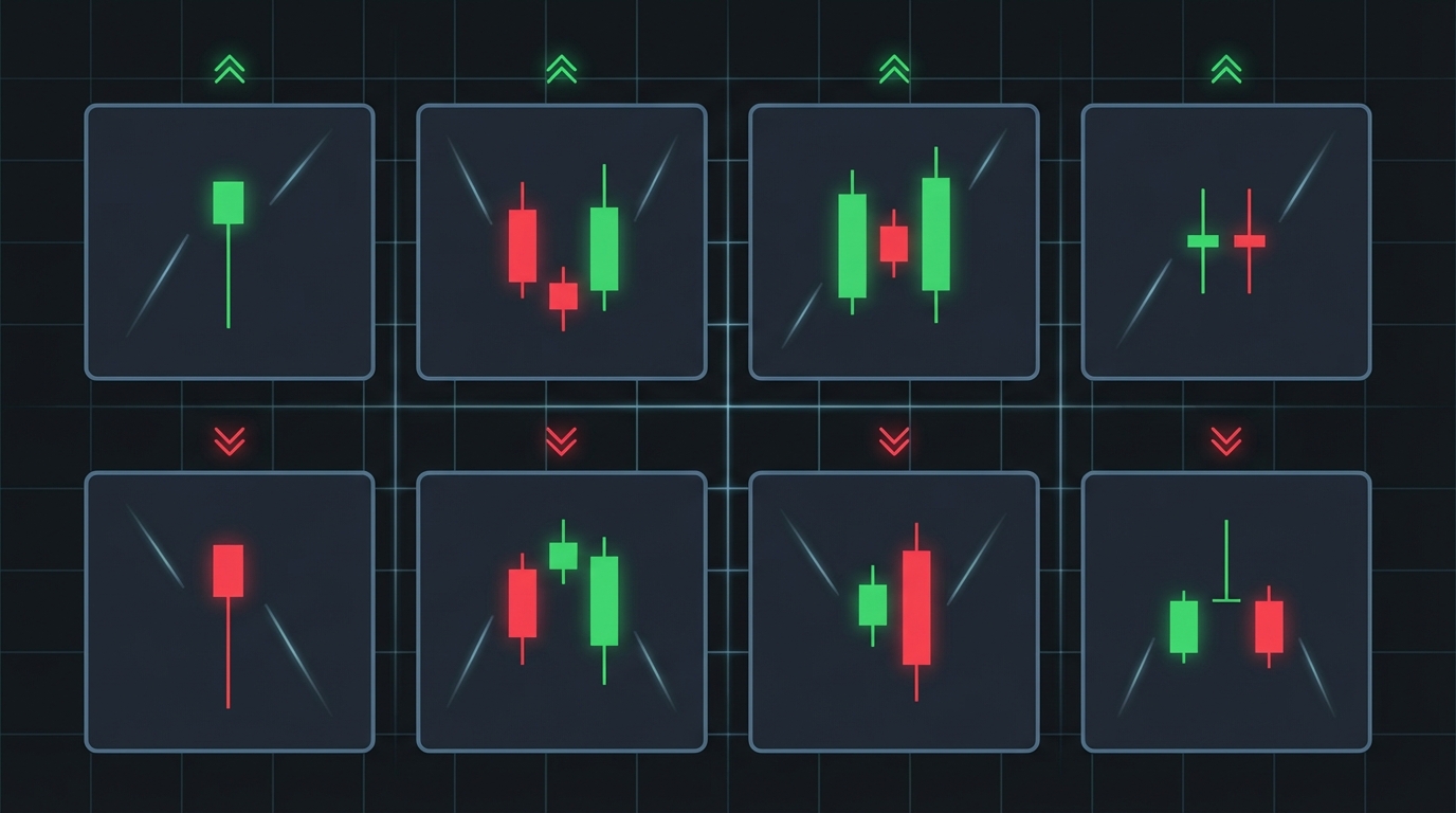
Single Candlestick Reversal Patterns:
- Hammer: Found at the end of a downtrend, a hammer has a small real body (bullish or bearish), a long lower wick (at least twice the length of the body), and a very short or no upper wick. It indicates that sellers initially pushed prices lower, but buyers stepped in aggressively to push prices back up near the open. This suggests potential bullish reversal.
- Hanging Man: Visually identical to a hammer, but it appears at the end of an uptrend. The long lower wick suggests that sellers emerged, pushing prices down, but buyers managed to close the price near the open. Its appearance after an uptrend signals potential bearish reversal.
- Inverted Hammer: Appears at the end of a downtrend. It has a small real body, a long upper wick, and a very short or no lower wick. It suggests buyers tried to push prices higher, but sellers pushed them back down. However, the higher close compared to the low indicates buying pressure and potential bullish reversal.
- Shooting Star: Visually identical to an inverted hammer, but it appears at the end of an uptrend. The long upper wick indicates that buyers attempted to push prices higher, but sellers strongly rejected the higher prices, pushing them down to close near the open. This signals potential bearish reversal.
- Doji: Characterized by a very small or non-existent real body, meaning the open and close prices are virtually the same. The length of the wicks can vary. A Doji signifies indecision in the market. When it appears after a strong trend, it can signal that the trend is losing momentum and a reversal might be imminent. There are several types of Doji (e.g., Long-Legged Doji, Gravestone Doji, Dragonfly Doji), each with slightly different implications based on wick length and position.
Multi-Candlestick Reversal Patterns:
- Bullish Engulfing: A two-candlestick pattern occurring in a downtrend. The first candle is a small bearish candle, followed by a larger bullish candle whose body completely "engulfs" the body of the first candle. This signifies a strong shift in momentum from sellers to buyers.
- Bearish Engulfing: The opposite of a bullish engulfing, occurring in an uptrend. The first candle is a small bullish candle, followed by a larger bearish candle that completely engulfs the first. This indicates a strong shift from buyers to sellers.
- Morning Star: A three-candlestick bullish reversal pattern appearing in a downtrend. It consists of a long bearish candle, followed by a small-bodied candle (often a Doji or spinning top) that gaps lower, and then a long bullish candle that closes well into the body of the first bearish candle. It represents a transition from bearish control to bullish control.
- Evening Star: The bearish equivalent of the Morning Star, appearing in an uptrend. It consists of a long bullish candle, followed by a small-bodied candle that gaps higher, and then a long bearish candle that closes well into the body of the first bullish candle. It signals a shift from bullish to bearish sentiment.
- Piercing Pattern: A two-candlestick bullish reversal pattern in a downtrend. The first is a long bearish candle. The second is a long bullish candle that opens below the low of the first candle and closes more than halfway up the body of the first candle.
- Dark Cloud Cover: The bearish equivalent of the Piercing Pattern, appearing in an uptrend. The first is a long bullish candle. The second is a long bearish candle that opens above the high of the first candle and closes more than halfway down the body of the first candle.
Continuation Patterns
Continuation patterns suggest that the current trend is likely to resume after a temporary pause.
- Marubozu: A powerful single candlestick with no wicks (or very small wicks), indicating that the open and close were the high and low for the period, respectively. A Bullish Marubozu (long green/white body) suggests strong buying pressure from open to close, often signaling continuation of an uptrend. A Bearish Marubozu (long red/black body) suggests strong selling pressure and continuation of a downtrend.
- Spinning Tops: Small real bodies with relatively long upper and lower wicks. They indicate indecision, similar to a Doji, but with a slightly larger body. In the context of a trend, they can signal a temporary pause before the trend resumes.
Importance of Context: It is crucial to remember that candlestick patterns are most effective when interpreted within the context of the overall market trend, support and resistance levels, and other technical indicators. A pattern appearing in isolation may be less reliable than one that confirms a signal from multiple analytical tools. Furthermore, confirmation from subsequent price action is often sought before acting on a pattern.
Key Takeaway: Candlestick patterns provide visual cues about market sentiment and potential future price movements. Reversal patterns (e.g., Hammer, Engulfing, Doji) signal a potential change in trend, while continuation patterns (e.g., Marubozu) suggest a pause before the trend resumes. Always consider the context and seek confirmation.
Support and Resistance
Support and resistance (S&R) are fundamental concepts in technical analysis, representing price levels where buying or selling pressure is expected to be strong enough to prevent the price from moving further in a particular direction. These levels are often described as invisible barriers on a price chart.
Defining Support and Resistance
- Support: A price level where a downtrend is expected to pause due to a concentration of buying interest. When the price falls to a support level, buyers tend to enter the market, preventing further declines and potentially pushing the price higher. Think of it as a "floor" for the price.
- Resistance: A price level where an uptrend is expected to pause due to a concentration of selling interest. When the price rises to a resistance level, sellers tend to enter the market, preventing further advances and potentially pushing the price lower. Think of it as a "ceiling" for the price.
The Psychological Basis
The effectiveness of support and resistance levels is largely rooted in market psychology. Traders remember past price levels where significant buying or selling activity occurred. For example, if a currency pair struggled to break above a certain price multiple times, many traders might place sell orders at or near that level, expecting it to act as resistance again. Conversely, if a price bounced off a certain level repeatedly, buyers might accumulate orders there, anticipating it to hold as support.
Identifying Support and Resistance Levels
S&R levels are not always precise lines but rather zones. They can be identified in several ways:
- Previous Highs and Lows: One of the most common methods. Significant swing highs often become resistance, and significant swing lows often become support.
- Horizontal Price Levels: Areas where the price has repeatedly reversed or consolidated in the past. These can be easily drawn on a chart using horizontal lines.
- Round Numbers: Psychological levels such as 1.1000, 1.2500, or 100.00 are often strong S&R levels because many traders tend to place orders at these easily remembered points.
- Fibonacci Retracement Levels: These are horizontal lines that indicate where support and resistance are likely to occur. They are derived from the Fibonacci sequence and are often used after a significant price move to identify potential retracement levels (e.g., 38.2%, 50%, 61.8%).
- Moving Averages: As discussed later, moving averages can also act as dynamic support and resistance levels, particularly longer-term ones.
Role Reversal (Support Becomes Resistance, Resistance Becomes Support)
A powerful characteristic of S&R levels is their tendency to reverse roles once broken. If a strong resistance level is decisively broken by bullish price action, it often transforms into a new support level. Conversely, if a strong support level is breached by bearish price action, it often becomes a new resistance level. This "flip" or "role reversal" is a common phenomenon and provides traders with opportunities to re-enter a trend or confirm its direction.
Significance and Strength of S&R
The strength of a support or resistance level is generally determined by:
- Number of Touches: The more times a price level has held as support or resistance, the stronger it is considered.
- Timeframe: S&R levels identified on longer timeframes (e.g., daily, weekly) are generally more significant than those on shorter timeframes (e.g., 5-minute, 1-hour).
- Volume: A strong breakout through S&R accompanied by high trading volume suggests a more conviction-based move.
- Recency: More recent S&R levels tend to be more relevant than very old ones.
Traders use S&R to identify potential entry points (e.g., buying at support, selling at resistance), exit points (e.g., taking profit near upcoming S&R), and to place stop-loss orders (e.g., just below support for a long trade, just above resistance for a short trade). While S&R levels are not infallible, they provide critical context for understanding market structure and anticipating price behavior.
Key Takeaway: Support and resistance are psychological price levels where buying or selling pressure is expected to halt or reverse a trend. They are identified by previous highs/lows, round numbers, and can reverse roles once broken. Their strength is determined by factors like the number of touches and the timeframe.
Trend Lines and Channels
Trends are the directional movement of prices over time, and identifying them is a primary goal of technical analysts. Trend lines and channels are visual tools used to define, confirm, and anticipate the continuation or reversal of these trends.
Understanding Trends
A trend represents the general direction in which a market is moving. There are three main types of trends:
- Uptrend (Bullish Trend): Characterized by a series of higher highs and higher lows. Buyers are in control, and prices are generally moving upwards.
- Downtrend (Bearish Trend): Characterized by a series of lower highs and lower lows. Sellers are in control, and prices are generally moving downwards.
- Sideways Trend (Ranging/Consolidation): Characterized by prices moving horizontally within a relatively defined range, with no clear upward or downward direction. This often occurs when supply and demand are in equilibrium.
Trends exist across all timeframes. A currency pair might be in a long-term uptrend on the weekly chart but experiencing a short-term downtrend on the hourly chart.
Drawing Trend Lines
Trend lines are straight lines drawn on a chart connecting significant price points, acting as dynamic support or resistance.
- Uptrend Line: Drawn by connecting at least two significant swing lows. The line should slope upwards. For the trend line to be valid, subsequent lows should touch or come close to the line without breaking below it. An uptrend line acts as dynamic support.
- Downtrend Line: Drawn by connecting at least two significant swing highs. The line should slope downwards. For the trend line to be valid, subsequent highs should touch or come close to the line without breaking above it. A downtrend line acts as dynamic resistance.
Rules for Drawing Trend Lines:
- Two Points Make a Line, Three Points Confirm: You need at least two swing highs or lows to draw a preliminary trend line. A third touch that holds confirms the validity and strength of the trend line.
- Avoid Forcing: Trend lines should fit the price action naturally. Do not try to force a line to connect points if it doesn't align well.
- Steepness: Very steep trend lines are often unsustainable and prone to breaking.
- Volume: A breakout through a trend line on high volume is often more significant.
Trend lines help traders identify the direction and strength of a trend. A break below an uptrend line or above a downtrend line can signal a potential trend reversal or a significant correction.
Trend Channels
A trend channel is formed by drawing a parallel line to an established trend line. This parallel line acts as a dynamic support or resistance level, creating a "channel" within which the price tends to move.
- Uptrend Channel: Formed by drawing an uptrend line (connecting lows) and then drawing a parallel line above it, connecting the swing highs. The upper line acts as dynamic resistance, and the lower line acts as dynamic support.
- Downtrend Channel: Formed by drawing a downtrend line (connecting highs) and then drawing a parallel line below it, connecting the swing lows. The upper line acts as dynamic resistance, and the lower line acts as dynamic support.
Trading within a channel involves buying near the support line and selling near the resistance line, or waiting for a breakout. Channels provide a clearer understanding of the price range within a trend, helping to set profit targets and stop-loss levels. A break out of a channel can signal a strong acceleration of the trend or a potential reversal.
Breakouts and Retests
When price breaks decisively above a downtrend line or below an uptrend line, it's called a breakout. Breakouts often signal a change in the trend or a significant move in the opposite direction. After a breakout, it is common for the price to "retest" the broken trend line (which now acts as new support or resistance) before continuing its move. A successful retest (where the price bounces off the retested line) can provide a higher-probability entry point for traders.
Trend lines and channels, like static support and resistance, are not foolproof but are powerful tools for visualizing market structure. They help traders identify the path of least resistance for price action and offer critical insights into potential turning points or continuations.
Key Takeaway: Trend lines define the direction and strength of price movements by connecting swing highs (downtrend) or swing lows (uptrend). Trend channels are formed by adding a parallel line, providing dynamic support and resistance. Breakouts from these lines or channels can signal shifts in market momentum.
Essential Indicators: RSI, MACD, Moving Averages
Technical indicators are mathematical calculations based on historical price, volume, or open interest data, designed to help traders interpret market conditions and forecast future price movements. While thousands of indicators exist, a few have stood the test of time and are considered essential for Forex analysis.
Moving Averages (MA)
Moving Averages are among the most widely used and fundamental technical indicators. They smooth out price data over a specified period by creating a constantly updated average price. This smoothing helps to filter out market noise and identify the underlying trend more clearly.
Types of Moving Averages:
- Simple Moving Average (SMA): Calculates the average of prices over a specified number of periods. Each period's price has equal weight. For example, a 20-period SMA sums the closing prices of the last 20 periods and divides by 20.
- Exponential Moving Average (EMA): Gives more weight to recent prices, making it more responsive to new information than an SMA. EMAs react faster to price changes, which can be beneficial for identifying trend shifts earlier.
How Moving Averages are Used:
- Trend Identification:
- When the price is consistently above a moving average, it suggests an uptrend.
- When the price is consistently below a moving average, it suggests a downtrend.
- The slope of the MA also indicates trend direction and strength (upward slope for uptrend, downward for downtrend).
- Dynamic Support and Resistance: Moving averages can act as dynamic support (in an uptrend) or resistance (in a downtrend). Prices often pull back to touch or interact with an MA before continuing in the trend direction. Longer-term MAs (e.g., 50-period, 200-period) are particularly effective for this.
- Crossovers (Golden Cross / Death Cross):
- A Golden Cross occurs when a shorter-term MA (e.g., 50-period) crosses above a longer-term MA (e.g., 200-period). This is generally considered a bullish signal, indicating a potential long-term uptrend.
- A Death Cross occurs when a shorter-term MA crosses below a longer-term MA. This is generally considered a bearish signal, indicating a potential long-term downtrend.
- Shorter-term MA crossovers (e.g., 10-period crossing 20-period) can be used for shorter-term trend signals.
Common MA periods include 10, 20, 50, 100, and 200, but traders often experiment to find the optimal settings for specific currency pairs and timeframes.
Relative Strength Index (RSI)
The Relative Strength Index (RSI) is a momentum oscillator developed by J. Welles Wilder Jr. It measures the speed and change of price movements. RSI oscillates between 0 and 100 and is typically used to identify overbought or oversold conditions in a market.
How RSI is Used:
- Overbought and Oversold Conditions:
- RSI values above 70 are generally considered overbought, suggesting that the price may be due for a pullback or reversal.
- RSI values below 30 are generally considered oversold, suggesting that the price may be due for a bounce or reversal.
It's important to note that in strong trends, RSI can remain in overbought or oversold territory for extended periods, so these signals should be used in conjunction with other analysis.
- Divergence: Divergence occurs when the price of a currency pair moves in one direction, but the RSI moves in the opposite direction.
- Bullish Divergence: Price makes a lower low, but RSI makes a higher low. This can signal a weakening downtrend and potential bullish reversal.
- Bearish Divergence: Price makes a higher high, but RSI makes a lower high. This can signal a weakening uptrend and potential bearish reversal.
Divergence is considered a strong signal, especially when confirmed by other indicators or price action.
- Centerline Crossover: The 50-level on the RSI often acts as a centerline. A move above 50 can indicate increasing bullish momentum, while a move below 50 can indicate increasing bearish momentum.
The standard setting for RSI is 14 periods, but traders may adjust this based on their trading style.
Moving Average Convergence Divergence (MACD)
The Moving Average Convergence Divergence (MACD) is a trend-following momentum indicator developed by Gerald Appel. It shows the relationship between two moving averages of a security's price. The MACD is calculated by subtracting the 26-period EMA from the 12-period EMA. A 9-period EMA of the MACD, known as the "signal line," is then plotted on top of the MACD to act as a trigger for buy and sell signals.
Components of MACD:
- MACD Line: (12-period EMA - 26-period EMA)
- Signal Line: 9-period EMA of the MACD Line
- Histogram: Represents the difference between the MACD Line and the Signal Line.
How MACD is Used:
- Crossovers:
- Bullish Crossover: When the MACD line crosses above the signal line, it's considered a bullish signal, suggesting upward momentum.
- Bearish Crossover: When the MACD line crosses below the signal line, it's considered a bearish signal, suggesting downward momentum.
- Centerline Crossover:
- When the MACD line crosses above the zero line, it indicates that the 12-period EMA is above the 26-period EMA, suggesting bullish momentum.
- When the MACD line crosses below the zero line, it indicates that the 12-period EMA is below the 26-period EMA, suggesting bearish momentum.
- Divergence: Similar to RSI, MACD divergence can signal potential trend reversals.
- Bullish Divergence: Price makes lower lows, but MACD makes higher lows.
- Bearish Divergence: Price makes higher highs, but MACD makes lower highs.
- Histogram: The histogram grows larger as momentum increases and shrinks as momentum decreases. A rising histogram above the zero line indicates strengthening bullish momentum, while a falling histogram below the zero line indicates strengthening bearish momentum. A shrinking histogram (whether above or below zero) can signal slowing momentum and potential reversal.
MACD is effective for identifying trend direction, momentum, and potential shifts, making it a versatile tool for many traders.
Key Takeaway: Moving Averages smooth price data to identify trends and dynamic S&R. RSI is a momentum oscillator for overbought/oversold conditions and divergence. MACD combines trend-following and momentum, offering signals through crossovers, centerline crosses, and divergence. These indicators are most effective when used in combination and with price action analysis.
Bollinger Bands and Volatility
Bollinger Bands, developed by John Bollinger, are a versatile volatility indicator that provides a dynamic range for price action. They consist of three lines:
- Middle Band: Typically a 20-period Simple Moving Average (SMA).
- Upper Band: Usually two standard deviations above the Middle Band.
- Lower Band: Usually two standard deviations below the Middle Band.
The standard deviation, a measure of volatility, is what makes Bollinger Bands dynamic. When volatility increases, the bands widen; when volatility decreases, they contract.
Interpreting Bollinger Bands
Volatility Measurement:
- Band Expansion: When the bands widen, it indicates increasing volatility and often precedes or accompanies strong trend moves.
- Band Contraction (Bollinger Squeeze): When the bands narrow significantly, it indicates decreasing volatility and often suggests a period of consolidation. A tight squeeze is frequently followed by a significant price breakout in either direction, as the market transitions from low to high volatility.
Dynamic Support and Resistance:
The upper and lower bands often act as dynamic resistance and support levels, respectively. Prices tend to revert to the middle band after touching an outer band. Approximately 90% of price action is expected to occur between the upper and lower bands.
Trading Signals and Observations:
- Reversals at Bands: A touch of the upper band followed by a reversal can indicate overbought conditions and a potential pullback. Conversely, a touch of the lower band followed by a reversal can indicate oversold conditions and a potential bounce. However, in strong trends, prices can "walk the band" for extended periods.
- "Walking the Band": During a strong uptrend, prices may repeatedly touch or hug the upper band as the middle band and lower band provide support. In a strong downtrend, prices may hug the lower band. This
Disclaimer: The information provided on this page is for educational purposes only and should not be considered as financial advice. Trading forex involves significant risk. Always conduct your own research and consider seeking advice from a qualified financial advisor.